Understanding Layers
We can spent a lot of time discussing the theory of what layers are in Photoshop, just like we could try to learn how to ride a bike by reading a lot of theory about it. Problem is, you could read every book and website there is on the theory of bike riding and still fall on your head the first time you try to ride one. The better way to learn would be to simply hop on that bike and start peddling, and that's exactly how we're going to learn about layers. Fortunately, we run much less of a risk of falling on our heads while learning about layers, but feel free to put on a helmet if it will make you feel safer.
Life Without Layers
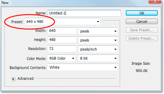
Before we look at what layers are and how to use them, let's first see what working in Photoshop would be like without layers. First, let's open a new document inside Photoshop. Go up to the Menu Bar at the top of the screen and click on the word "File" to bring up the File menu options. The first one at the top of the list is "New". Go ahead and click the word "New", which brings up the New Document dialog box as shown below:

Don't worry about naming the document since we won't be keeping anything we're doing here. The second option from the top though is "Preset", and this is where we can choose from a variety of ready-to-go document sizes. If it doesn't say "640x480" as the document size beside the word "Preset", simply click on the down-pointing arrow to the right of the Preset option box, which brings up a list of all the available preset document sizes, and choose "640x480". It's not vital that you use 640x480 as the document size here, it simply helps to keep us both on the same page.
Once you've chosen your document size, the only other option we need to look at for this example is near the bottom of the dialog box, "Background Contents". Make sure it says "White" as the background contents, again so we're both on the same page while working. If it doesn't say "White", click the down-pointing arrow to the right of that option box and select it from the list.
Once you've chosen 640x480 for the document size and have your background contents set to white, go ahead and click the "OK" button, and Photoshop will bring up the new document you asked for, sized to 640x480 pixels with a background color of white:

I've resized mine in the screenshot above so it fits better on the web page, so don't worry if your document looks larger in Photoshop than mine does here. This one has purposely been made smaller.
Now that we have our new document open and ready to go, let's start drawing on it. We'll keep our "art work" very simple for this example, since we're really just trying to understand layers, not showcase our creative abilities.
Select the Rectangular Marquee Tool from the Tools palette. It's the icon in the top left of the Tools palette which looks like a square made up of dashed lines, as shown below:

With the Rectangular Marquee Tool selected, left-click your mouse anywhere inside your document and drag out a selection. Make sure to hold your mouse button down as you drag the selection out. Any size of a selection will do. If you want to drag out a perfect square, all you need to do is hold down the Shift key on the keyboard as you drag, and that will constrain the proportions of your selection to a perfect square. When you're happy with your selection, just lift your finger up off the mouse button and your selection will be complete. Here's mine below:

Again, your selection doesn't need to be the same size or be in the same location as mine. Anything even remotely similar will do just fine.
Now that we've dragged out a selection, let's fill that selection with a color. First, we need to pick a color. Near the bottom of the Tools palette, you'll see two relatively large squares, with the one on the left looking like it's sitting in front of the one on the right:

These are our Foreground and Background Color selectors. The square on the left is our current foreground color, and the square on the right is our current background color. By default, Photoshop sets the foreground color to black and the background color to white, which is why those are the colors of the squares in the screenshot above. Your squares may be different colors if you've been working in Photoshop already. If you want to reset them to the default colors of black and white, simply press the letter D (for "Default") on your keyboard. Also, if you want to quickly swap the foreground and background colors, just press X on the keyboard. Pressing X again will swap them back.
Let's choose a nice bright red for our color. Left-click your mouse inside the left square (the foreground color selector) in the Tools palette, and Photoshop will pop up the Color Picker dialog box, where we can choose a new color to use:

If this is the first time you've seen the Color Picker, you may be thinking, "Geez, I can't even pick a color in this program without it trying to intimidate me!", but what Photoshop is really trying to do is give you as many ways of communicating with it as possible so it knows exactly which color you want. You may find it easiest to simply click your mouse on the color red to select it. A web designer, on the other hand, may be used to choosing red using the hexadecimal value #FF0000 which is how web browsers understand color. Someone who comes from a print background may be more comfortable setting ink percentages to select red. Photoshop wants to give everyone the ability to select color using the method they're most comfortable with, and that's why the Color Picker dialog box looks like there's way too many options here for something as simple as choosing a color.
For the purposes of what we're doing here, which is to understand layers, not color theory, we're going to keep things simple by ignoring everything in the Color Picker except the "visual way" of selecting a color. In other words, let's ignore everything to the right of the tall, narrow color bar, as shown below:

The "visual way" of selecting a color in the Color Picker dialog box is a simple two-step process. First, we pick the "hue" that we want. The hue is the actual color itself, for lack of a better term, be it red, green, blue, yellow, or whatever the case may be. The main color itself is known as the "hue". Once we've chosen our main color (the hue), we then select the level of saturation and brightness we want for that hue. "Saturation" refers to how light the hue is (how much white is mixed in with the hue), and "brightness" refers to how dark the hue is (how much black is mixed in with the hue). Once we've chosen our hue, our saturation and our brightness, we have our color!
The area of the Color Picker we're looking at here (the area in the screenshot above) is divided into two sections. There's a large square on the left, and a long narrow bar on the right. The long narrow bar is our hue selector. It contains every hue there is in the rainbow, and selecting one is as easy and moving your mouse pointer inside the bar and left-clicking your mouse on the hue you want. Want red? Left-click on a red area. Green? Left-click on a green area. Same for blue, yellow, orange, purple, etc. For our example here, let's pick a red color, so move your mouse over a red area in the hue selection bar and left-click to select red.
The large square area to the left of the hue selection bar is the saturation and brightness selector. When you clicked on a red hue in the hue selection bar, the large square area became red (if it wasn't red already). Now we can choose how saturated and bright we want our red hue to be. The area in the top right corner of the large square represents the "pure" color. This is the spot where there is no white added to make the hue lighter and no black added to make it darker. As you move further to the left of this spot, the hue appears lighter because you're moving the hue closer and closer to white. As you move down from this spot, the hue appears darker because you're moving the hue closer and closer to black. Let's pick a nice "pure" red for our example, so go ahead and left-click your mouse in the top right corner of the saturation and brightness selection square. You'll notice as you move your mouse inside the area that it changes to a circle to help you better see the saturation and brightness levels you currently have the mouse over. Click up in the top right corner of the square, as shown below:

We now have our red color! Why did we choose this red color? We chose it because we're going to fill that selection we dragged out a moment ago with this red color, that's why. Let's do that now. Go back up to the Menu Bar at the top of the screen and this time click on the word "Edit", which brings up all the Edit menu options. Near the middle of this list of options is the word "Fill". Click on it, and the Fill dialog box appears on the screen:

For "Contents", make sure "Foreground Color" is selected beside the word "Use:". If it's not, click on the down-pointing arrow and select Foreground Color. This will tell Photoshop that we want to fill our selection with the foreground color we've chosen in the Color Picker, which in this case is red (unless you chose something different just to be, you know, different). Don't worry about any other options in the Fill dialog box. Once you have Foreground Color selected, click OK, and Photoshop will go ahead and fill your selection with red:

Press Ctrl+D (on a Windows system) or Command+D (on a Mac) to deselect the newly-filled shape. You should now have something on your screen that looks relatively close to what I have above.
So far so good. In fact, that first filled selection turned out so incredibly well that we want to add a second filled selection to our document. Let's do that. First we need a selection, so select the Rectangular Marquee Tool from the Tools palette again and drag out another selection. Just for fun, start your selection from somewhere over top of the existing red shape so that the new green shape will be overlapping it a little. Not too much, just a little, so we can still see the red shape behind it. Once you've dragged out your new selection, we need to pick a green color to use, so go back to the Foreground Color selector square in the Tools palette and click on it, which brings the Color Picker back up. Left-click your mouse on a green area inside the hue selection bar, and then left-click on the saturation and brightness levels you want for the hue in the large square area on the left. Once you've chosen the green you want to use, click on the OK button. Finally, to fill our new selection with the green color, we need to go up to the Edit menu in the Menu Bar at the top of the screen and select "Fill" from the list of options, which brings up the Fill dialog box. Make sure "Foreground Color" is selected for the "Contents", and click the OK button. Photoshop will go ahead and fill the new selection with green. Press Ctrl+D (Win) or Command+D (Mac) to deselect the selection, and you're done. Here's what I have below. You should have something similar:

If that isn't a work of artistic genius, I don't know what is. Although.... hmmm........
You know, now that I've been looking at it for a while, I'm not sure I'm happy with something. See how the green shape is in front of and overlapping the red shape, as it is in yours as well if you've been following along? I think I want the red shape to be in front of the green shape instead. Yeah, that's the problem. The red shape needs to be in front of the green shape. Then this work of art will truly be a masterpiece! Let's go ahead and swap those red and green shapes so the red one is in front of the green one.
We do that by..... um.... hmm. Uh oh. I think we have a problem here. How do we do that?? The simple answer is, we can't. There's no way to move that red shape in front of the green one because the green one isn't really in front of the red one at all. It's just an illusion. The green shape is simply cutting into the red one, giving the illusion that it's in front of the red one.
So okay, we can't move the red shape in front of the green one. That idea is out. At the very least then, let's move the green shape away from the red one so it's not cutting into the red shape at all. Let's do that now. We can do that by..... Uh oh.
We can't do that either! There's no way to move that green shape independently of the red one because they're both stuck together. In fact, it's not just these two shapes that are stuck together. They're also stuck to the white background color. Everything in our document - the red shape, the green shape, and the white background, is stuck together! We can't move anything without moving everything. We're so limited with what we can do with our work now, it's depressing. If we want to change something, our only real options are to either undo and undo and undo through all our steps and then redo the work again from the point where we want to make the change, or we can scrap the whole thing and start all over again from scratch. Neither one of those options sounds very appealing to me. There must be a better way to work, one that will give us the freedom to make these changes without having to redo anything or start over.
Fortunately, there is. Let's try the same thing, but this time using layers.
credit to:
Photoshop Essentials